Here are my two final Logos one in the Two color and the other with just black and white. I am pretty happy with how the whole thing came out. You might notice some slight changes from my last post which of course were intentional.

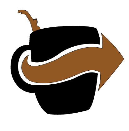
 So this is what I came up with for my Logo, I think it works better than what I was trying to do with all the other ones and the typeface just felt right with the logo. I think I enjoy the black and white one more than the black and tan/brown one, the way it breaks up the Coffee Cup is so much more Dynamic to the design.
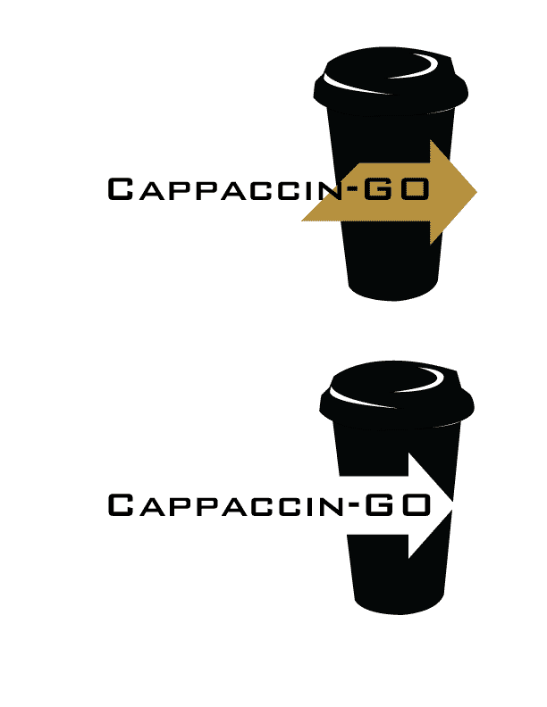
 The one on the top is a variation of the logo, I like how it came out. I am going to try and apply the Type into the arrow like the above post. The one on the bottom was the beginning of playing with the type. This is just me getting crap out of my head on what I should do with the applying type to the logo.
 So this is a revised thumbnail after our art direction we had in class. I messed some other things but really liked how this one came out. I scanned it in and put it into illustrator. Traced it but I am having the most trouble with placing the Cappaccin-go in accordance with the Logo itself. Still some things to do but it is coming along nicely.