
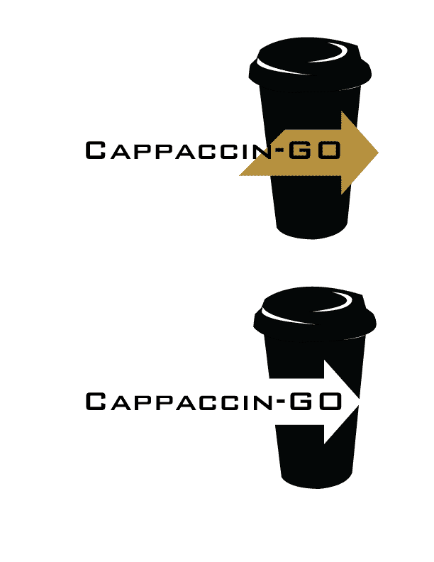
 So this is what I came up with for my Logo, I think it works better than what I was trying to do with all the other ones and the typeface just felt right with the logo. I think I enjoy the black and white one more than the black and tan/brown one, the way it breaks up the Coffee Cup is so much more Dynamic to the design.
I was happy with myself after this.
:]
No comments:
Post a Comment