

Monday, August 9, 2010
Experimentation #3 | Shapes and Opacity
So somewhere in between working on my website, finishing working on the Seattle City Chickens Poster and Brochure, and trying not to stress out, I decided to work work with shapes in Adobe's Illustrator program, and work with opacity as well. I actually have been meaning to play with all sorts of shapes in Illustrator but haven't had the time to work on them. You could say this is the start of the shape and opacity posters. How I went about making the cubes was just me using the polygon tool in Illustrator and started to make cube designs with them. Each polygon is the same color and has the same opacity of 30%. How I got a variation in the colors was just placing a polygon over the top of one and eventually made this design. I decided to take it into Indesign after I made this in Illustrator and put some type on top of it. You could say this is an informational poster about Cubes. Hope you enjoy this experiment as much as I did.

Monday, August 2, 2010
Inspiration #2 | Valo Brand
About three weeks ago my roomate Collin decided to show me a rollerblading video featuring pro skater Montre Livingston, needless to say I got extremely pumped/excited after watching the video. A little history about me if you want to know why I got so excited and amped for an aggressive rollerblading video is because back in High School that was what I did, I wasn't all into skate boarding because I just didn't feel right on a board with wheels. Ever since I was a little kid I could not stop rollerblading, and it continued to roller hockey then to aggressive rollerblading. Anyways back on topic after watching the video Collin and I decided to go to the local skatepark here in Poulsbo (its kinda of puny) and do a little blading. I had so much fun just messing around at the skate park, not to mention the work out I got from it. So now I decided I am going to be skating a bit more and more and enjoying the fun in rollerblading again. This is my inspiration post of the week, I was snooping around on the internet, looking at what new skate stuff is out and what has changed. I happened to stumble upon a cool new brand called VALO that has gotten much praise for there construction, comfortability, how well they skate. But I really think it is all apart of their aesthetic, their skates literally look like a big shoe with wheels on the bottom and I just love the whole look to their skates, not to mention their well designed website, and most of all VALO's packaging. Did I mention they also have accessories as well that are just as good. This inspired me to want to do get even better at designing things and packaging design. So now the visuals! Enjoy


Heres a Link to their WEB SITE.
Erik Bailey signature skate. EB.1 these are simply amazing looking.


These are also really growing on me as well. The Alex Broskow Gold edition Valo Skate. AB.1 Gold


And I am going to leave you with a video of team VALO rippin it up in AMSTERDAM.
Monday, July 26, 2010
INSPIRATION #1 | Stranger & Stranger
About four months ago before I had this blog I had encountered a mysteriously awesome bottle of Black Spice Rum at my neighborhood Albertson's that I use to work at during my high school years. This rum is called "the Kraken" black spiced rum but what caught my eye was the wonderfully beautiful design on the bottle, which speaks for the whole product and the design firm it was made by, Stranger & Stranger. This design firm specializes in creating identity and packaging for Beer, Wine, and Hard "A" companies alike, this place would be the ultimate dream job for me. Without further delay here are some of my favorite designs by them. All designs are done by Stranger & Stranger design firm and they have two locations, one in New York and one in London. Link to their web site I would highly suggest to look at all of their wonderful designed products .
THE WHOLE BOTTLE

A CLOSER LOOK

EVEN CLOSER LOOK

MAMONT VODKA bottle was molded by a Real Mammoth Tusk

A lovely wine label for THE WAXED BAT shiraz wine

This beautifully elgant and Modern White Wine Called Ogio is a Favorite design of mine and its a Best Seller. I wonder why? ;]

Lets take a CLOSER look at the Label

An awesome Homage to the Early Hollywood Movie Posters. The Red Monster a California Red Wine, it really speaks for itself.

Love this Cable Car Beer, It Speaks San Fran and it should, It was hand crafted there.

A beautiful Cerveza for Rialto in San Salvador the largest City in El Salvador, San Salvador is know for its Sun Temples hence the design.

Look at those Temples

The Knot Irish Whiskey. I don't think I have much to say about this one except just look at it. IT'S BRILLIANT!

The Spice Tree, a Scotch Whiskey

And Last but not Least, Occasio Merlot Wine. The pocket watch illustration would make me buy this wine in a heart beat.

Wednesday, July 14, 2010
Experimentation #2 | Oval and French Curve
 So after my first experimentation with my ovals I decided to use the ovals and the french curves to create shapes and add personalities to the shapes. Really just having fun with the stencils as you can tell. Nothing really that was planned to look like anything just some fun.
Personal Art | Block Print
 About a month ago my girlfriend and I decided to be a little creative and do some block prints for ourselves. I love block printing, the inconsistancy from the block to the paper and all the flaws in the print make them so beautiful and unique in there own stature. This print I decided to do a graphic grizzly bear just because grizzlies are bad ass. I used a refrence from a photo I found on google images and just made it work for a block print. I think I may do another print of some sort of animal this weekend if I have time to get to it.
 A link here on block printing techniques and how to get started if you want to do some yourself :}
Monday, July 12, 2010
Experimentation #1 | Oval Stencil
 Mostly when I draw I usually don't use any help from stencils. I actually rarely use stencils to create drawings, in a way I think of it as it as a way cheating. The human hand speaks so much more to me as an artist. However I decided to break out of my box by using a stencil of various sized ovals that my french curve set has on the inside of them. This is just a piece of 11 x 17 paper, I used a regular writing pen, I'm not to worried about the archival issue with this because I was just really experimenting, though this was a start of many other themed small drawing I did inside my sketch book. I also can see myself using this in my graphic design to create cool looking patterns and shapes. I throughly enjoyed breaking out of my box and using a stencil to create these little "experiments". You may never know can come from trying something new.
P.S. for those who don't know what archival is I attached a link to the word archival just so you can get an idea of what it means. Also put a link on french Curve to let you know what it looks like.
Saturday, July 10, 2010
Sketch Book | Drawing Four
 Just a little vampire drawing I did in my spare time at school. All line simply pen and ink line work. AB or O positive?
Wednesday, June 30, 2010
Salsa | Website Thumbnails


 Not only are we designing labels for the Salsa company we did the logos for we are also designing a website for the company TOO. My thumbnails were all based on a pretty square format of how the page would be layed out. Though my main concern of how the website would be to look the labels and tie in nicely with everything. My comp is going to look similar to the middle image, but with the nice curly brackets on the side instead of the top. I took elements that I used in my labels but I am still thinking of how the website will look with colors and what kind of background or no background at all. I am going to have to sit and ponder those. I will update with my comp sometime during the weekend or next week.
Sketch Book | Drawing Three
 I actually did this one a while back in this semester. This idea popped right into my head so I decided to sketch it out. Not the most original idea but I had fun drawing it out. It really was just spontaneous and I like that sometimes. I also was experimenting with texture using a micron pen.
Sketch Book | Drawing Two
 This little doodle just came out of nowhere. I began with the bottom part of the Light Bulb which I didn't actually plan it to be a light bulb. I like to call this my "intuitive drawing". So this is where I like to just start drawing without an object of what I want to draw. All I really have an object for is random shapes, then I'll stop and imagine what it might be a part of or what feels right. In this instance it looked like the bottom of a light bulb and thats what I made it. I with things like this and other doodles I like to add a little saying that might hint a more underlying factor to the create some mystery to the drawing. For this one I put "had any good ones today?" I will let you try and figure that out on your own.
Sketch Book | Drawing One
 This is going to be the start of some weekly updates with doodles I do during free time, class time, or when I am feeling a little creative.
This all started with a very little cursive writing of the word crab that was placed in between little brackets that was inside some of my class notes. I liked the little thing so much I made it biggger with a little Crab guy and added a little word "yum". After who doesn't like crab.
Tuesday, June 15, 2010
Salsa Packaging | Label
 Mi Madre's Salsa Label. I am pleased with the way it came out and can't wait to work on the other labels for class. Of course the colors will be different, and some of the little element of the front of the the label will change with the flavors and temperatures of the salsa.
Friday, June 11, 2010

Salsa Packaging Thumbs | Mi Madre's Kitchen


Here are my Thumbnails for my Salsa Packaging project from typography class. I think I am going to enjoy do this packaging and of course I have to include the logo I did for Mi Madre's Kitchen.
Salsa LOGO | Mi Madre's Kitchen

So this is close to being done. I have to work on the letter spacing and sizing a little bit more. I will post the revised one soon.
Sunday, May 23, 2010


Wednesday, May 19, 2010
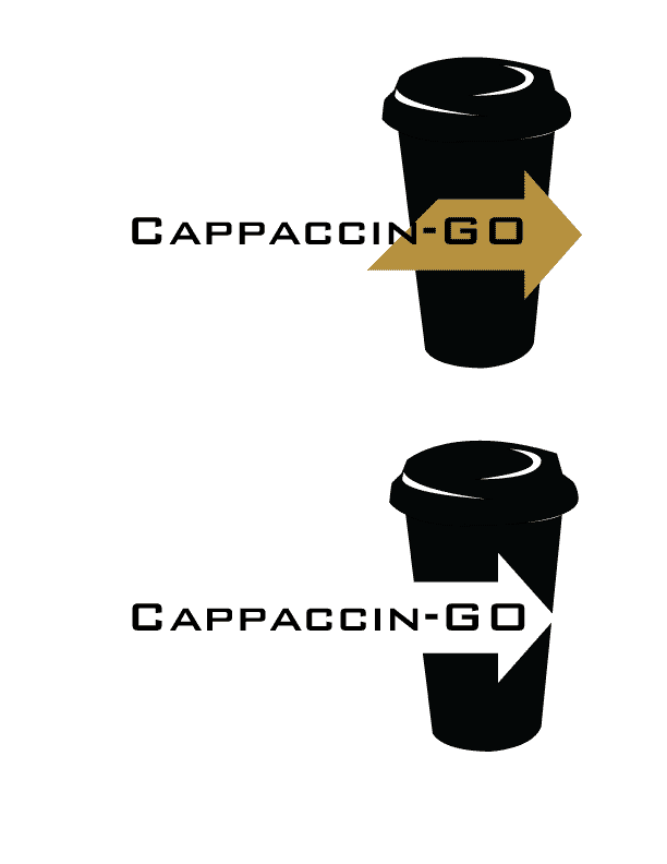 So this is what I came up with for my Logo, I think it works better than what I was trying to do with all the other ones and the typeface just felt right with the logo. I think I enjoy the black and white one more than the black and tan/brown one, the way it breaks up the Coffee Cup is so much more Dynamic to the design.
I was happy with myself after this.
:]
Tuesday, May 18, 2010


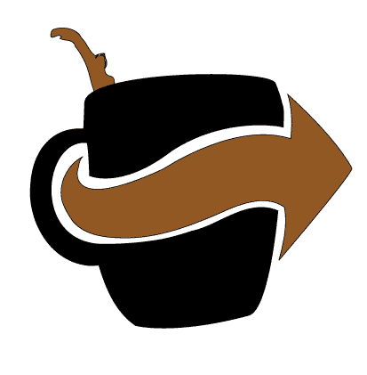
 The one on the top is a variation of the logo, I like how it came out. I am going to try and apply the Type into the arrow like the above post. The one on the bottom was the beginning of playing with the type. This is just me getting crap out of my head on what I should do with the applying type to the logo.
Monday, May 17, 2010
 So this is a revised thumbnail after our art direction we had in class. I messed some other things but really liked how this one came out. I scanned it in and put it into illustrator. Traced it but I am having the most trouble with placing the Cappaccin-go in accordance with the Logo itself. Still some things to do but it is coming along nicely.
Tuesday, May 11, 2010


Friday, May 7, 2010
Subscribe to:
Comments (Atom)